I registered chocolatehedgehog.co.uk a few years ago while working for an internet hosting company, basically to develop my skills and learn about hosting, DNS, domain transfers, etc. It also gave me an online presence to showcase my work and skills to prospective employers that was previously only on my localhost webserver at home.
It also presented me the opportunity to play with developing a logo and brand identity etc, which I enjoyed much more than I expected, being more interested in the back-end mechanics of web applications and database structures more than front end UI looks.
Partly on the strength of this online showcase of my work, I got the job with the company I now work for, which is very small company. As such I have been lucky enough to be heavily involved in all areas of the business, including on the marketing and branding side of things. Much of my work is now shaping the identity of the company and unifying the look and feel of the website/documents/manuals/newsletters/cd cases etc., a process again that has bought me a great deal of satisfaction.
I realise I am now in danger of rambling, so I will now attempt to get to the point; the experience I have gained since my initial registration of chocolatehedgehog has inspired me to rebrand (and rename) my webdesign portfolio site. My reasons are as follows:
- chocolatehedgehog is a nightmare to type, and at 17 characters is far too long
- everybody has heard of the cake recipe the name is associated with, which has nothing to do with webdesign
- my logo is far to pictorial – there are no clean lines
- I registered it on a whim without any real thought process or planning
Having had this “on the back burner” for some time now, I have thought things through properly and sketched out some criteria in my head:
- short concise domain name
- related to web design
- possibly a play on words to keep it light-hearted
The name
I was considering 3 letter domain names for a while, and the best one I found was w0d.co.uk – web 0 (zero) designs(?) which I didn’t like the sound of, so discounted it straight away. I soon afterwards concluded that all the good 3 letter domain names are taken. I bet the more astute among you will be able to guess where I went next. No? Anyone? Well, I used a scrabble dictionary of four letter words with their definitions, and scanned through some that caught my eye, and ran whois checks to see if they were registered.
The one that I went for in the end was cyte meaning cell, or relating to cells, but also being pronounced “site”. Here was my link to webdesign, play on words and only 4 letters. Unfortunately the .com had already gone, and is associated with icyte.com – a cloud based system for storing web favourites and files.
So I have registered cyte.co.uk, cytedesign.com and cytedesign.co.uk.
The Logo
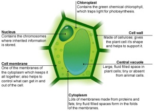
The cell theme was also conducive for a unique logo design – based on a cell. I took inspiration from the gemometric shapes in a hexagonal plant cell. I also preferred to the green colour scheme to the pink of an animal cell.
So my starting point was the classic cell diagram from GCSE Biology pictured below (credit to the BBC Bitesize revision site for the image).
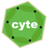
I then put my own geometric and symmetrical twist on it, retaining the detail of the cell walls and chloroplasts, and finally replaced the nucleus and central vacuole with my new brand name. The new site is still under construction and has my new logo as the holding page at the time of writing.
If you’ve followed this through till this point I’m impressed, and grateful, and I hope you can gain something from this insight into my creative process.

